Tsuki is a conceptual minimalist jewelry brand inspired by the moon’s quiet beauty and Japanese simplicity. Created as a passion project, it explores timeless design through pieces that evolve like the moon—calm, constant, and ever-changing. Meant to complement, not compete, each piece reflects subtle strength and quiet elegance.
All image assets used were sourced from Pexels.
A minimalist brand calls for a logo that’s equally refined — clean, understated, and quietly impactful. Subtle, thoughtful details bring it to life, echoing the delicate character of the jewelry itself. A moon dots the “i” in Tsuki, nodding to the brand’s name and lunar inspiration, while a star within the “u” symbolizes individuality and the belief that everyone deserves their moment to shine. The “u” also reflects the wearer — placed at the center, it represents how each person becomes part of Tsuki’s story. A refined serif typeface ties it all together, expressing elegance and versatility — just like the pieces, designed to be worn anywhere, anytime.
REACHING OUR AUDIENCE - SOCIAL MEDIA POSTS
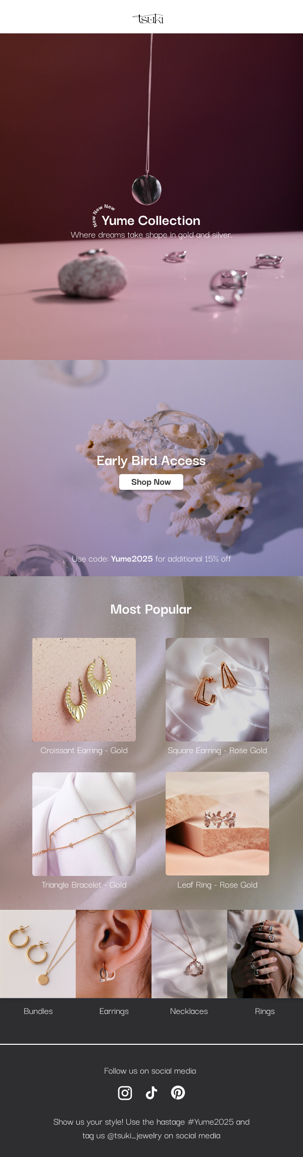
Instagram Post 1
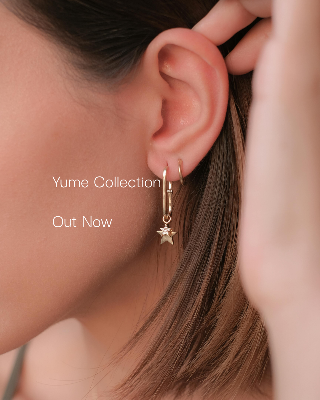
Instagram Post 2
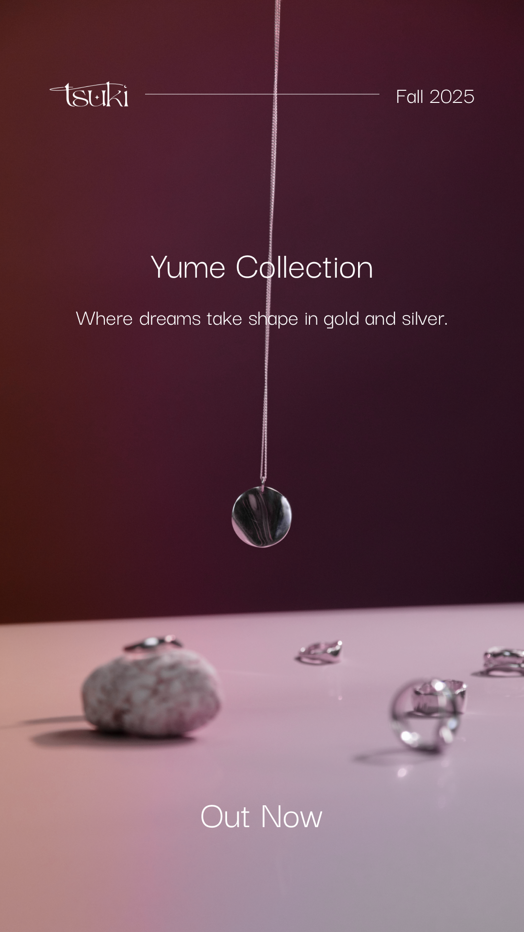
Instagram Story 1
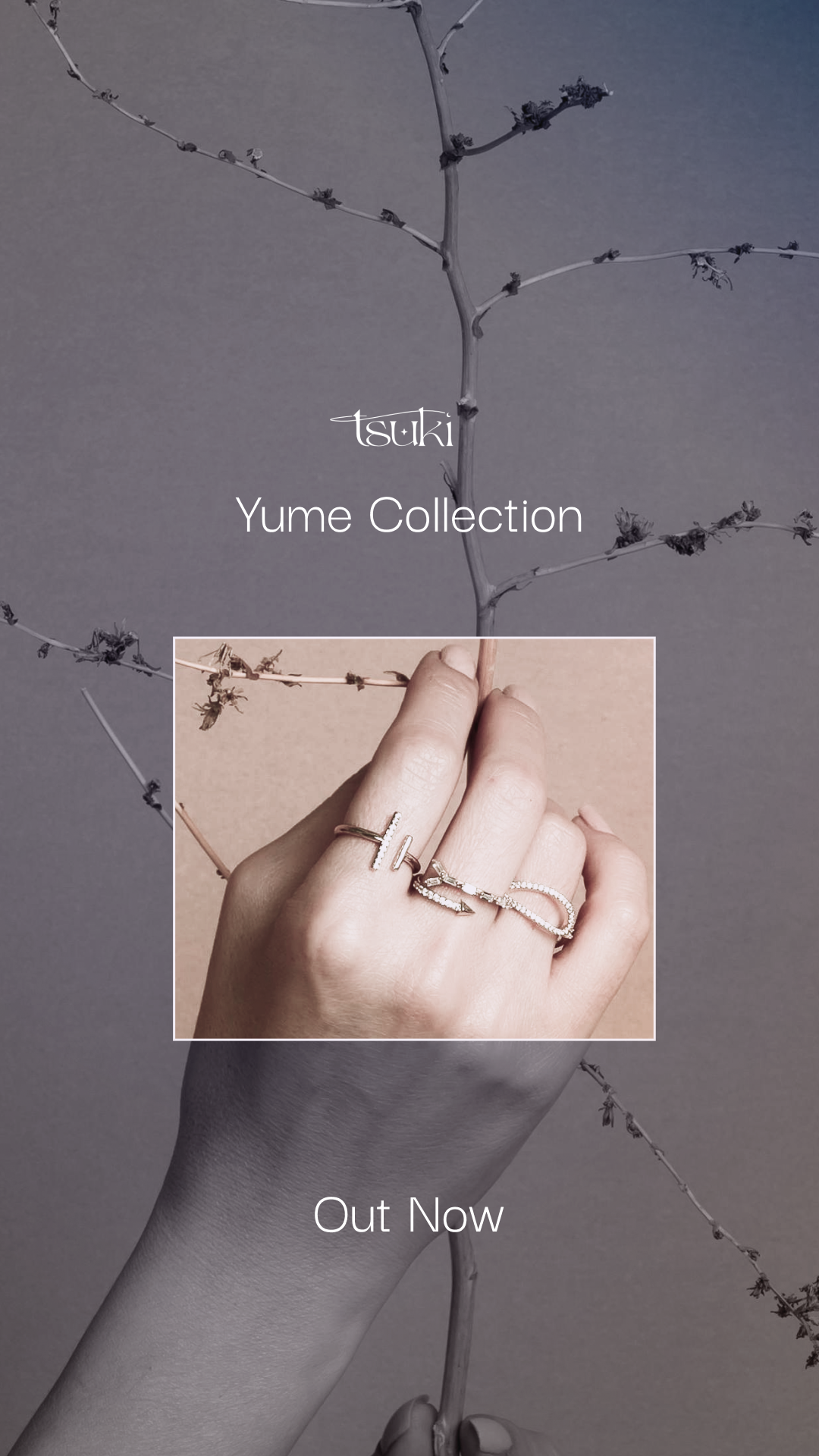
Instagram Story 2
DING! YOU'VE GOT MAIL - EMAIL CAMPAIGN